Display less stuff
Strava is a website for tracking your athletic activity. I recently wanted to find a ride from a year or so ago.
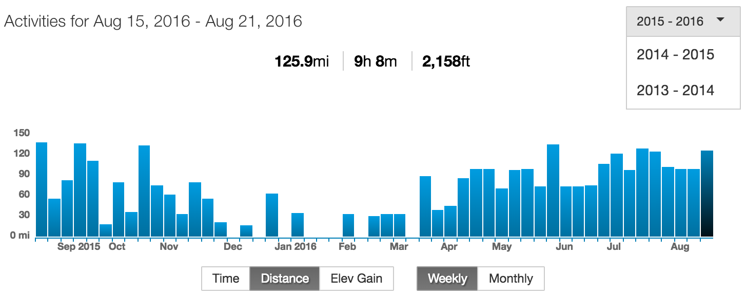
I went to my profile page, and saw this:
It’s not obvious how to get to rides before September 2015.
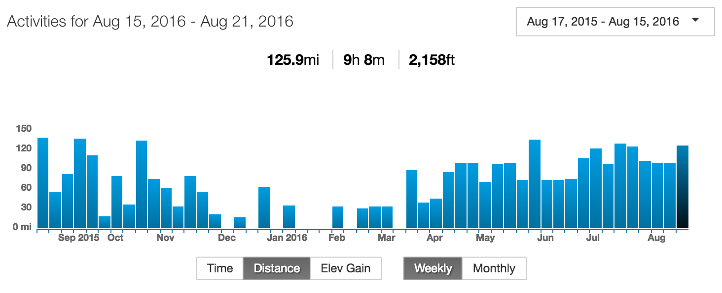
Clicking the drop down menu, I saw this:
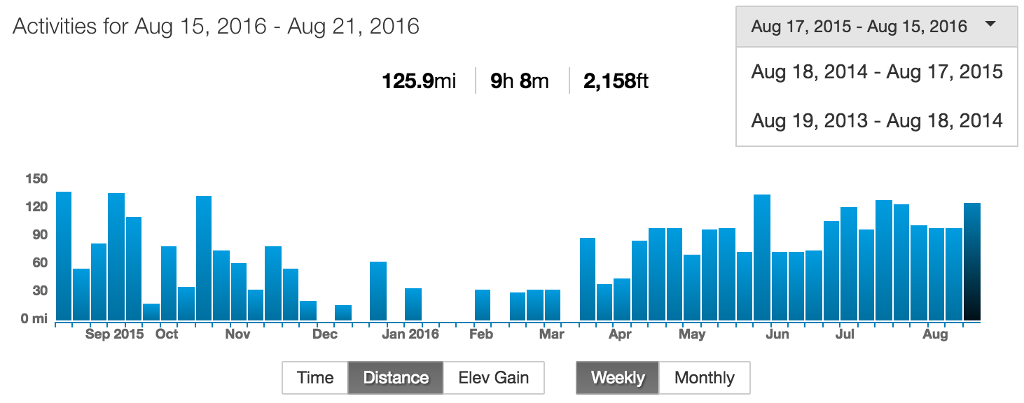
“Why can I only select from the last three weeks of rides?” I thought to myself. But then I realised. This is the year selector.
Why doesn’t it look like a year selector? Because it shares exactly the same formatting as the week selector in the header:
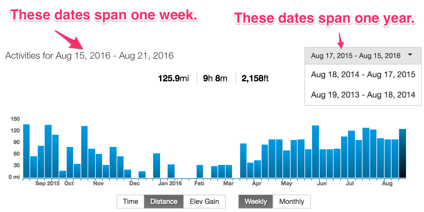
How can they make it more obvious that this is in fact the year selector? By displaying only the part users care about: the year.